
Summary:
pantone fashion color report spring 2007
New York Fashion Week, September 8-15, 2006New York fashion designers are flourishing in a season of new beginnings, using surprising neutrals with innovative splashes of corals, yellows and purples to create a spring in bloom.Tarragon is the freshly cut stem to the blossoming shades of sweet Strawberry Ice, warm Golden Apricot and violet-infused Hollyhock. Cafe Creme is the rich, creamy contrast to the serenity of calming Sky Blue or the deliciousness of refreshing Grapemist. The yellow glow of gleaming Green Sheen and the blushing beauty of diaphanous Silver Peony reflect the infusion of life brought by spring.
from: http://www.pantone.com/products/products.asp?idArticle=944&idSubArea=0&idArea=4
More info and designers:
http://www.pantone.com/articles/pdfs/PANTONEspring07.pdf

What’s hot isn’t just determined by Pantone or the designers, it’s the people and the media. If I could predict what would be the “it†colors for spring would be they would be rich deep versions of orange and raspberry sherbet colors with a lot of white – things that are a hint preppy, some well done paisley’s and stripes. This is what I’m leaning towards myself because when I find myself buying too much of one color I tend to start looking for another color.
I think that the chocolates, teals and light chartreusy-lime colors will stick around in the background.

3 Comments
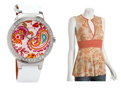
The shirt is Sweet Pea’s Orange Floral Mesh contrast banded tunic. Found on Amazon.com but there’s only Large still available. http://tinyurl.com/sx3xo
While I’m at it, I’ll go ahead and mention that the watch is Guess http://tinyurl.com/nd9y9
As for fashion jewlery – let me look a little. I tend to wear the same old same old and buy one to two new pieces (usually earrings because that’s my preference) each year and haven’t looked too much at the jewelry yet because I’ve been shopping for a new winter purse.
what can you suggest for fashion jewelry 2007?
Pretty top! Where is it from?